Thursday 18 August 2011

Communal Area

This is the latest design for the communal area. More an evolution of the previous design the main alteration is the colour palette. The walls will likely be a dark grey/blue contrasting with the off white/silver areas. The colour used in the below images is not confirmed and will be looked at in the next few weeks. It will certainly not be as dark as rendered here.


Two perspex screens now slightly separate off the dining area giving somewhere to shoot past/through. They can have a frosting design if required. Next to the dining table will be a clear "whiteboard".. imagine "Waking the Dead". Gives us an opportunity to have some graphics (maps, scientific stuff) in the background when shooting the dining area.


On the other side of the dining area will be wood panelling, probably a walnut colour which will imitate cupboards. In previous designs the wood looked just aesthetic however in a ship you would not have that luxury. These panels will be MDF with a fablon covering, then adding handles/plates.


The main light source that I want in the set is below in the interior buttresses. Whether this light could pulse and maybe change colour from blue to warning red would be interesting. Many of the screens dotted around the set will be static however i do want to have a couple with moving images. Ill looks into this. 


After discussions with Paul we have decided that a complete roof will not be needed. I can have a partial roof on standby which we can place over areas of the set if needs be.

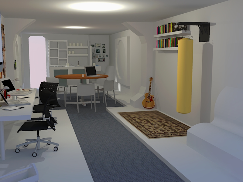
From an dressing stand point we discussed the idea of this shuttle being new and very modern but the crew having there own furniture, as if they have been asked to bring it in. This means we can have a very eclectic mix of modern and older textures. If anyone has seen Serenity that is a good comparison.

Ill be refining various details over the next week and speaking to the workshop soon. Ill contact everyone individually to discuss the necessary areas of the set. Ill update on the storage area/bedrooms etc soon.


Wednesday 27 July 2011

Developed Design

Main addition to this design is the wood panelling. Rather than making the set look like a sauna or something James May would design, im going for modern walnut coloured panels. Ill post reference photos above. Combined with the futuristic lighting on the buttresses and then the addition of rugs etc, it has that "doesn't know what it wants to be" feel we have talked about. Also adds to the minimalist look described in the script.


Remember these designs may feel very clinical/white but once we have aged areas, added photos/logos/stickers etc it will look much better.


Rather than these just being panels they can act as lockers for the crew. The panel on the floor gives the idea that there is a shaft making the whole shuttle feel larger.


Monday 25 July 2011

Layout

Based on the floorplan detailed previously, this is a 3d mock up of the layout. The open rooms for the control centre and quarters would probably be redressed.


Thursday 21 July 2011

Early Floorplan

With the workshop needing to know some details about the set i've done this temporary floorplan based on the second draft of the script. More work will be going into this over the next week so we can start firming up major construction elements. Excuse the roughness of this drawing, didn't have time for autocad!


Wednesday 20 July 2011

New Design Idea

The newest design for the set is below and overall i am much happier with. There are a number of alterations to the original designs. Firstly the kitchen area has been reduced, and now incorporates shelving which would store meals. Having a sink/fully working kitchen would not be practical on a shuttle. The meals would be self contained and then thrown away and recycled. Therefore doing away with plates etc. The same idea was used in Moon but i will have a think about how to do something a little different.


Secondly the control station has been moved into the overall communal area. This will be separated by a partition of some kind so it can be closed over from the communal space. The control station is sparce in this design but will be looked at once the overall design has been confirmed. 


The interior buttresses are also now overhead. Whether this is practical i don't know. I have also run a panel across the top which could be used for lighting. This is something that needs discussing further as to whether it would be safe/affordable/do-able.


The corridor is now at the side of the design. This is something i wanted to try in order to have the control room present in the main structure. I'm aware this moves away slightly from the tube shaped station described in the script but its something to have a think about. This corridor would obviously lead to the storage area. I think this area would have to be constructed separately from the communal area.


I have included a seating area and a design for the main door at the other end. This seating area would be the recreation area. My idea for the blank parts of wall would be to have panels that look like they would open. I will obviously include a number of screens around the set. Although having working screens would be nice, there is one way of simulating screens. By having plexiglass panels cut and then mounted a clear vinyl sticker placed behind them would give the impression of a screen. Again these are the things that the extra money in the budget would allow us to do.


New Set Design Wireframe


New Set Design


Tuesday 5 July 2011

More Set Design Ideas

Focusing mainly on the space and dimensions, i've given the area a narrower feel but still incorporating the kitchen area of previous designs. I like the idea of a sleek white space simulator cluttered up with normal everyday items. More elements need to be included to make it more like a space simulator such as the partitioning seen below. As always click for larger versions.


Saturday 2 July 2011

Renders of Initial Set Design

Development of the set has started properly but first i completed some renders of the initial design. Using sunlight at the moment while without a roof. Feels very white! Click on the images for larger versions


Monday 27 June 2011

Costume Ideas

A selection of costume ideas based on the logo i worked on previously. My current feeling is that the atmosphere in the ship would require a light-weight casual shirt but with official logos/nametags on. This logo can be transferred to caps etc. Black cargo trousers would probably work as well, but i imagine their own clothes can be worn nearly all the time with the addition of the shirt.

More Logo Designs

Another selection of logo designs for the Mars 2. I personally prefer the originals but had a go with a few different fonts.

Saturday 25 June 2011

Early Set Design Visualisation

This is the first initial design for the Mars II set. Rendered in SketchUp this early concept shows the rough layout of the set based on the first script read through. Apologies for the poor quality render!

Branding Mars II - Logo Design

A logo design for the Mars II. Again incorporating the red circle used in previous designs this logo would primarily appear on costumes.

Branding for Mars II

Its important that the brand identity of the Mars II is nailed down pretty quickly allowing us to focus on other areas quickly. These are the first ideas for the Mars II logo. The inclusion of the "Advanced Simulation Facility" is up for debate. Should this be a way of convincing the crew that Mars II is a simulation?